ACCESSIBLE DESIGN
“When we design for disability first, we often stumble upon solutions that are not only inclusive but are often better than when we design for the norm” – Elise Roy
Not only does accessible design ensure that our work and our messages can be reached by as many people as possible, but it also helps us to improve our project overall by encouraging innovation to overcome the stigma surrounding disabilities. Understanding different experiences and different perspectives allow us to tailor our work and consider alternatives, rather than relying on our audience all having, for example, perfect colour perception to understand a particular message.
The tips below are just a few small changes and considerations that you can take to make your artwork more accessible - whether it is print or digital.
USE SIMPLE COLOURS WITH GOOD CONTRAST
Colour contrast is often overlooked, but it can make your work 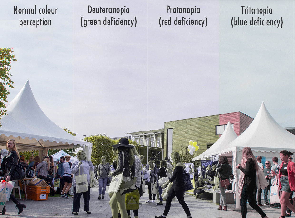 easier to read for those on the autistic spectrum, or those with low vision or colour blindness. The free WebAIM colour contrast checker is a quick and easy way to work out whether your chosen colours are legible when paired together, and can be used to find colour combinations that are easy to distinguish.
Color Oracle is a great free app that easily shows you what those with colour vision impairments see when they look at your work. It applies different coloured filters to your screen to simulate common colour vision impairments, allowing you to adjust your colour schemes and reassess the colours used in your work to ensure the final product is legible to everyone.
USE A SANS-SERIF FONT
Fonts that are elaborate or decorative can be difficult to read as the letter shapes become confusing and less defined. Serif fonts (fonts that have the little decorative lines on the letters, such as Times New Roman, and Georgia) can be difficult to read as the serifs distract the eyes and brain from the letter themselves. Serifs are also prone to pixilation on screen, which can give words a blurry look that is difficult to read.
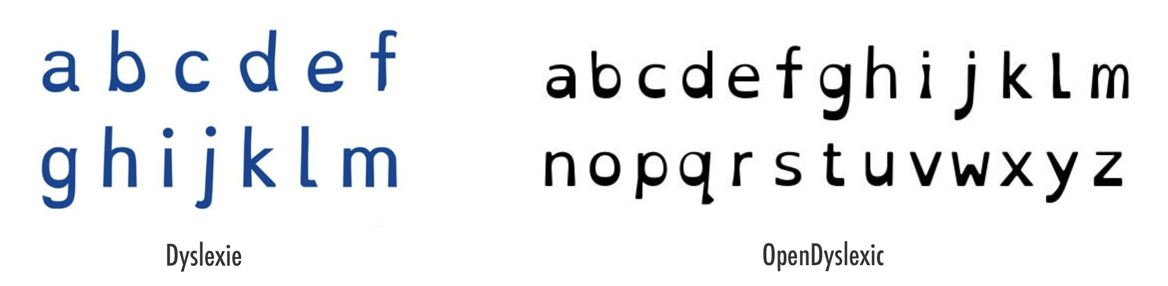
Sans-serif fonts (fonts that don’t have the extra little decorative lines) are often easier to read for those with dyslexia. Arial, Verdana, Futura, Helvetica, and Century Gothic are the most accessible sans-serif fonts available on most computers.
There are also several different specialist fonts available that have been designed to be legible for people with dyslexia. Dyslexie and OpenDyslexic are both free to download and have been designed to stop any confusion between letters (such as rn and m, and b, d, p, and q).
DESCRIBE ANY IMAGES, AND PROVIDE TRANSCRIPTS FOR VIDEO
People with low vision often use screen readers which convert text to speech so that the user can listen to a document or webpage. Image descriptions on web pages ensure those with low vision get the same experience when using your website. Add your image description in the <alt> attribute of the image, or simply in the text surrounding it to give the image context.
If you are including videos in your work, provide transcripts or captions for your videos to ensure that they are still accessible to those who have low vision, are deaf, or hard of hearing. Amara Editor is an easy and free to use caption and subtitle editor that enables you to caption and subtitle any video. It produces a caption file – a plain text document with time codes to indicate start and stop times of captions – that is simply added to your video when you upload it.
Click here to learn how to add captions to videos on YouTube
Click here to learn how to add captions to videos on Facebook
Click here to learn how to add captions to videos on your webpage using HTML5
DON'T UNDERLINE, USE ITALICS, OR ALL-CAPS
If you need to emphasis certain words or phrases, don’t underline them or use italics as these tend to make the letters appear as though they run together. Similarly, using all block capitals for full sentences can make words look like an unreadable wall of text (though using caps for logos, headings, abbreviations, and acronyms is usually fine). If you need to emphasise certain parts of your text, then use bold, though make sure to use it sparingly otherwise you won’t actually be emphasising anything.
USE IMAGES AND DIAGRAMS TO SUPPORT TEXT
Having your information available in more than just one format makes the content more accessible as users are able to take ininformation from their preferred medium. Use images and diagrams on web pages that are wordy to support the text (though make sure the images have a description too). Using coloured boxes in your designs can also help to draw attention to certain areas, though make sure the colours are a suitable contrast to your text/foreground colours.
MAKE SURE YOUR LAYOUT IS SIMPLE AND ACCESSIBLE
Some simple layout techniques can make your web pages or printed leaflets/posters much more accessible. Justify everything to the left-hand size with 1.5pt line spacing if possible, and avoid irregular indentation that breaks up text and makes it appear jagged and difficult to read.
Follow a linear and logical layout that flows easily – don’t spread bits of information all over the page if it can be helped as this can confuse those who use screen readers or who have low vision. Remember that some users on your website may be magnifying text to 200%, so make sure that the text flows and is still visible at high magnification so that the user doesn’t have to keep on scrolling horizontally to read.